Website Design & Dev
web development

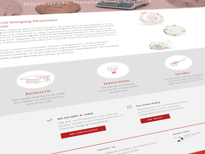
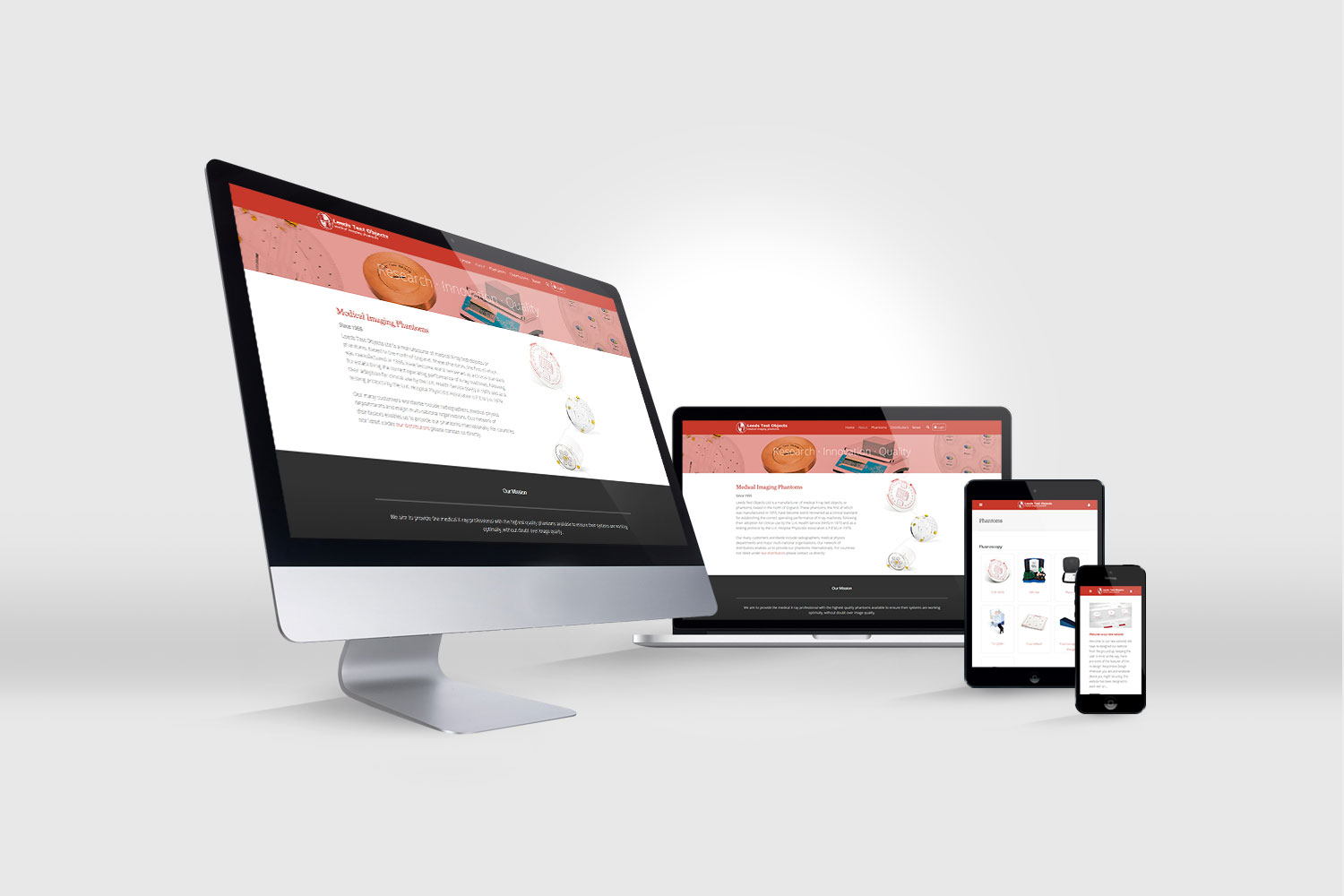
A full-scale redesign and migration from a legacy platform on to WordPress, updating the visual presentation of the brand to be more modern and appealing in line with the market at large. The brand colours were changed from a cold and clinical theme to more evocative and strongly contrasting in order to reflect the bold and concise messages around quality - in both service and high-end products.
These ideas are communicated throughout using a sharp sans-serif font in combination with a complementing serif to add a sense of heritage, alongside clean product imagery and custom illustrations.

The Aim: Simple But Effective
Following the methodology the company employs with its products, the website visuals and content are clean and concise - providing just enough detail to inform visitors of key information about the products, any more can be obtained from the company or one of its many distributors. The same applies to the navigation system and site architecture, everything should be in easy reach.